If I say 9.58 seconds, 240 international matches, or 3 extra shots, does that ring a bell for you?
In every sport, a number signifies who the winner is. Numbers are also increasingly used during competitions to show the current score in real time. You may even have seen graphs and visualizations during TV broadcasts!
In this blog post, I’ll walk you through three examples of how you can improve your presentations and communication with simple graphs — inspired by the world of sports. Maybe you saw something similar during the Alpine World Championships in Saalbach, or you can keep an eye out for them in future broadcasts.’
Bring a boring table to life with bars
The human brain is slow at processing tabular data. To find the relevant and vital information, we need to read row by row.
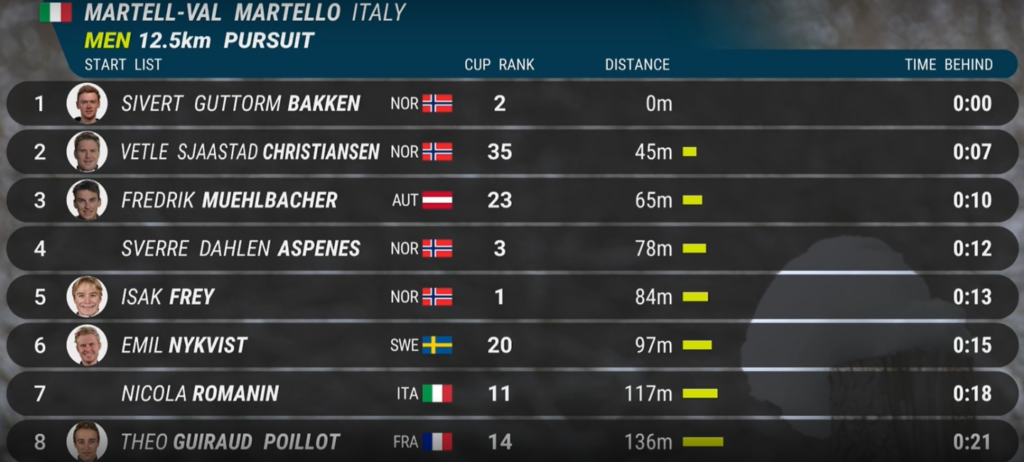
Take, for instance, the following table, taken from a biathlon pursuit race. The yellow bar chart is intended to guide the viewer by clearly showing the distances between the skiers at the start. The relative time scales are also listed on the right, but isn’t it much easier to understand the order of magnitude with the yellow bars?
What does a closely contested match mean?
You’ve probably heard someone say that a match was closely contested – but how can this be presented visually?
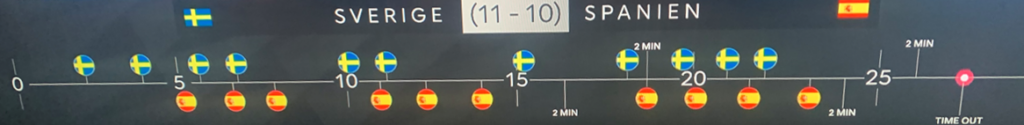
In the following example, taken from a handball match, each goal has been plotted on a timeline. This provides a clear picture of how the match unfolded and when the decisive goals were scored.
Real-time analysis
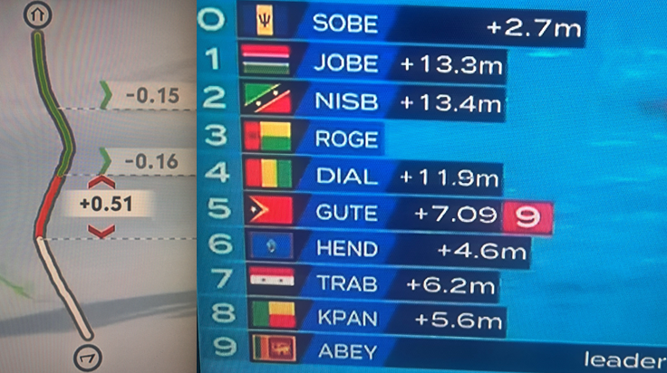
In slalom and swimming, real-time visualizations are frequently used, with green and red markers and bars showing how a competitor moves back and forth during the race. As the human eye struggles to perceive small changes, these visualizations help the viewers follow the competition.
Now, as a writer, I happen to be used to graphs, but sometimes all the flickering bars, times and colors can be a bit too much. Sometimes, perhaps, a sport should just be allowed to be a sport.
Take your analysis to the next level
The three aforementioned instances demonstrate how visualizations can aid the viewers to understand and follow what is happening – and we’ve probably only seen the beginning of this trend.
Finally, I’d like to encourage you, the reader of this blog, to take action on how you can improve your presentations visually. My simplest tip: spruce up a dull Excel table! Why not try a bar chart for turnover or the number of customers?
Good luck!

Whether you want to spruce up your Excel spreadsheets, get to grips with your figures, or keep pace with real-time data, we can help you take your analysis to the next level.
Magnus Fälth works as an Advisor for Analytics & Sustainability at Epical
magnus.falth@epicalgroup.com
+46 73-231 6363
LinkedIn
Contact us

Ulrika Bjurinder
Business Development Executive, Epical
WE HELP YOU
Data analytics
Turn dashboards into decisions. We help you create trusted metrics, shared business understanding, and analytics that people use to act with confidence.
Sign up for our newsletter
By subscribing, you agree to our privacy policy.